
Overview
Every designer needs a personal brand to represent themselves visually.
Audience: Viewers of my website
Result

Tools Used
Adobe Illustrator
Process
Understand & Explore
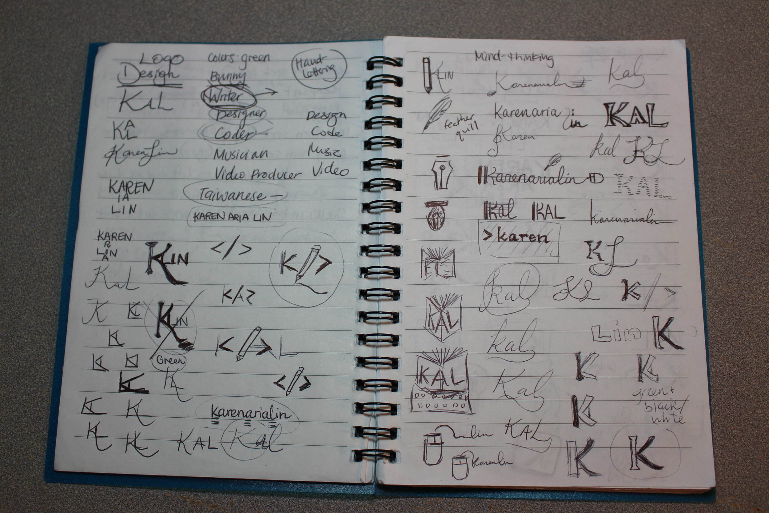
I researched techniques for developing logos. The most clever ones are simple but have multiple layers of meaning. They can be easily drawn, reproduced, and scaled while representing the style and values of the brand bearer.
Define & Ideate
Armed with pen and notebook, I sketched out ideas that represented my interests and identity. The design I settled on was a simple and subtle “K” that combined a Western font with part of the Chinese symbol for “water.” Perfect for an Asian American.
Implementation
Once I had my designs on paper, it was simple enough to draw them out in Adobe Illustrator.
Conclusion
I’m happy with the design, except that the serifs in the left half made the whole “K” look old-fashioned. I later swapped it out with a sans-serif font.
Fun fact: In the music logo variation, the K resembles the alto clef symbol that is used in viola sheet music. The music notes are at the “A” and “E” position to represent the vowels in my name.