Short stories

Mochi through Space and Time

Published by Haven Speculative (2023)

Connection (Game On! anthology)

Purchase from Kindle, Barnes & Noble, Kobo, Zombies Need Brains

Published by Zombies Need Brains (2023)

Ascent of a Lifetime

Published by Pulphouse Fiction Magazine (2022)

Moving to the Drumbeat

Published by The First Line (2020)

Squirrels Don't Judge

Published by Flash Fiction Magazine (2020)

Author biography

By day, Karen Aria Lin is a technical writer in the software industry. By night, she writes speculative fiction stories. She contributed to the 2024 Aurora Award-nominated anthology GAME ON! by Zombies Need Brains. Her short fiction has also been published in Pulphouse Fiction Magazine, Haven Speculative, and The First Line. When not writing, she is sending routes at the climbing gym or hiking with her Taiwanese Mountain Dog in the lush Pacific Northwest.


Work background.png

 Work


Design


Work background.png

 Work

Code


Work background.png
 
music-logo.png

Music Composition and Performance

Music has been a big part of my life since I was 4. My specialty is classical percussion performance, but I've also trained in other instruments and genres.

As a member and officer of UC Berkeley's Undergraduate Composers Club, I composed and performed several original compositions.

Highlights

Ringtone
Composed and performed by Karen Lin on marimba

Quiet Night Thoughts

a classical Chinese poem set to music
Composed by Karen Lin
Performed by Ziming Li on voice, Drew Zagieboylo on viola, and Yvonne Lau on piano

Caverna Virtual

Premiere of "Caverna Virtual" composed by Eric Delgado

Performed by Karen Lin on marimba

Seeing

Composed by Jessee Freeman

Performed by Karen Lin (marimba) and Austin Nguy (organ)


Mozaic Project

mozaic.jpg

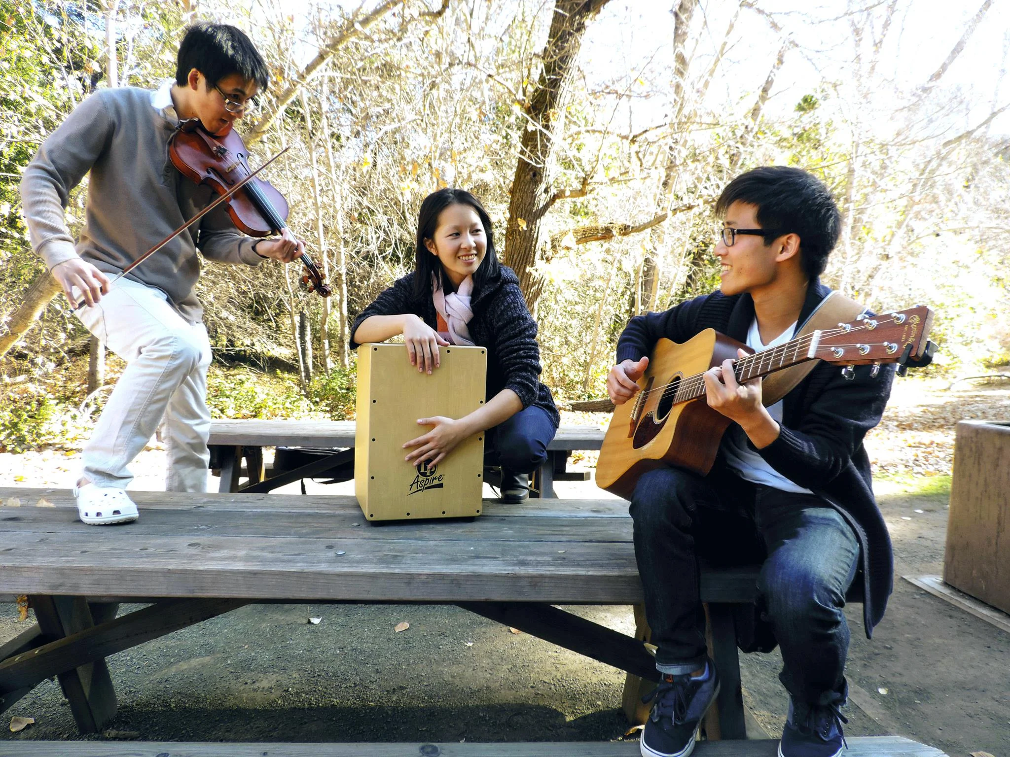
An instrumental pop trio with yours truly on percussion

I formed an instrumental pop trio with pianist Donald Chen and violinist Michael Hwang while we were undergraduates at UC Berkeley. We recorded YouTube videos and played live shows at Sliver Pizzeria. I improvised and performed with a variety of percussion instruments, including cajon (the wooden box that sounds like a drum set), tambourine, egg shaker, djembe, woodblock, and glockenspiel.

We’ve performed at Sliver Pizzeria in Berkeley, Lyft’s San Francisco headquarters, and Donald’s own wedding.

Highlights

Links: Youtube and Facebook


Work background.png
 

Overview

Multimedia Journalism at The Daily Californian was part of the newspaper's initiative to incorporate digital media and new forms of storytelling. Thanks to the fast pace of the news cycle, our team had to film, edit, and publish videos quickly. As newspaper staff, I also published columns and infographics. 

Summary: Publishing videos on Daily Cal's website and YouTube and Facebook pages

Audience: Viewers on campus, YouTube community

Highlights

A controversial video that was popular on Reddit and garnered 700,000+ views on YouTube. It was awarded Best News Video from the California College Media Association.

Exploring the Intellectual Playground

My graduation farewell column

This feature takes a look at the important role Cal's marching band plays in school spirit on campus.

Letting It Go

A Disney-themed meditation on life's irritations

Tools Used

DSLR camera, lavalier mike, Adobe Premiere Pro, YouTube, Ableton Live

Process

Understand & Explore

filming.jpg

The first step in any story was to understand the key people involved  - the "stakeholders." Often this is the mastermind of a protest or the leader of a group at an event. It's best to get people from opposing points of views to understand a conflict (good stories often center on a conflict).

Define & Ideate

I can get a good idea of how the story will flow from talking to the stakeholders or reading press releases. I'll know what kind of quotes I want to include in the video, so I'll ask someone to describe an event or protest to get a "summary" quote before digging into how they feel about it. The fun part of each shoot is collecting B-roll footage from my surroundings to set the scene. 

Implement

After I collect the footage, I load the clips back at the office and start editing. The story structure emerges - I search for the right quotes to open and close the video, then match B-roll shots on top of the relevant interviews. It’s actually similar to editing a written article. If music is necessary, I'll write my own music or request a clip from a music producer. 

Iterate

The Multimedia editor has to approve a video before publishing it to make sure the story make sense and complies with paper guidelines. The video could go through multiple iterations during this process before being published on YouTube, Facebook, and the Daily Cal website.

Conclusion

I found that I improved with each video. Once, I got a nasty shock when I played back my clips and heard only silence. After that fiasco, I made sure to test my microphones before every interview.  

It’s always a great feeling when people appreciate that I took the time to tell their stories. Journalism is most rewarding when I make connections with people and communities. 


Work background.png
 

Overview

In the digital age, it’s important to have an online presence. I coded the first iteration of my website on my own, which helped me grow as a developer. I enjoyed creating my brand and iterating on it the more I learned about design.

Audience: Anyone who wants to know who I am and what I do!

Result

Tools Used

Adobe Illustrator + Brackets + Google Fonts + Github Pages + Jekyll + Namecheap + Google Analytics + Sketch + Invision

Process

ITERATION 1

Understand & Explore

sketches.jpg

Online portfolios usually include a standard set of information: biography, project showcase, and resume. I researched many online design portfolios for inspiration. Through other people’s websites, I could see the latest web design trends, which I used as guidelines. Most had a combination of single-scroll vs multiple page layouts, and clean, flat UI. 

Define & Ideate

After I collected ideas and decided on content, I went to work sketching ideas on paper. I rapidly came up with multiple design options to choose from. Here I worked on finding a color palette, which I wanted to be nature-themed. Lots of green and blue.

Prototyping

Design1.png

Time to turn paper wireframes into mockups in Adobe Illustrator. I found that some designs didn’t translate well to the screen, so I chose the most practical version and iterate on it.

Implementation

I vowed to use this project as an opportunity to practice coding, so I used pure HTML/CSS/JS for the first version. I discovered that I was using lots of repetitive code in the headers and footers. The images loaded slowly, and the design left something to be desired.

Testing

After I deployed the code to Github Pages, I tested the link with Google PageSpeed Insights. The results told me to leverage browser caching, and eliminate render-blocking JavaScript and CSS. 

I also sent the link to friends for design feedback.

ITERATION 2

Understand & Explore

During the next research phase, I discovered Jekyll, the static site generator that played nicely with Github Pages. It would reduce the repetition in my code.

Define & Ideate & Prototype

Redesign.png

With the feedback from friends and family, I came up with a new design.

Implementation

Jekyll made coding much easier. I also worked on making the site mobile responsive and signed up for Google Analytics so I could spy on visitors.

Testing

I corrected most PageSpeed issues by optimizing images and deferring some JS loading. Mobile responsiveness wasn’t perfect, but nothing was broken.

ITERATION 3 - present

I continued to ask for feedback from people around me, especially fellow product designers. I continued to learn more about coding and information design. And I finally got Sketch to design future iterations.

Conclusion

An online portfolio reflects your identity, which can evolve quickly when you’re learning. I’ve had to constantly revisit my portfolio since it’s gone up. As a writer, I still found crafting the right copy for these project pages to be the hardest part. As a developer, I’ve learned so much about the ins and outs of building a webpage.


Work background.png
 

Overview

I came up with this idea when I was thinking about how to convey information to people through interactive infographics, using my technical writing background to create step-by-step documentation. It was also a chance for me to practice drawing graphics using 100% pure HTML/CSS/Javascript.

Audience:  General audience, nature lovers

Result

Tools Used

Sass, Waypoints.js plugin, Codepen.io, Evernote, Adobe Color

Process

Understand & Explore

research.png

Internet research was pretty simple for this project, since most how-to articles outlined similar steps. Of course, in true paper-writing fashion, I collected the links to compile into a bibliography. Citing sources is important! 

Define & Ideate

Once I broke down the steps, I sketched a scene for each one, keeping them similar to create visual continuity throughout the tree-planting process. I explained them to people I knew, to make sure the steps made sense. 

Implement

Coding time! I realized I could create drafts of each graphic using Codepen.io so I could focus on each one before integrating them into the site.

It was tricky to find a way to activate animations when users scroll to a certain "trigger points" on the screen, so I searched for a plugin and eventually found Waypoints.js. 

codepen.png
 

Test

I had to make sure the site worked on mobile, that colors were compatible, and that the site was browser compatible. Not perfect, but I had a working site. 

Conclusion

In the research phase, I wish I had time to drive to Osh Kosh and interview someone or watch someone actually plant a tree. 

I discovered how useful Codepen.io was as a learning tool and enjoyed using Sass for the first time. Variables and mixins save so much time and headache. Unfortunately, CSS was still quite a headache, so I wish I could have used a framework to make my life easier. With more time, I also could have found a technical solution to incorporate my original animation design.


Work background.png
 

Overview

Every designer needs a personal brand to represent themselves visually.

Audience: Viewers of my website

Result

anatomyoflogo.gif
logo-pattern.gif

Tools Used

Adobe Illustrator

Process

Understand & Explore

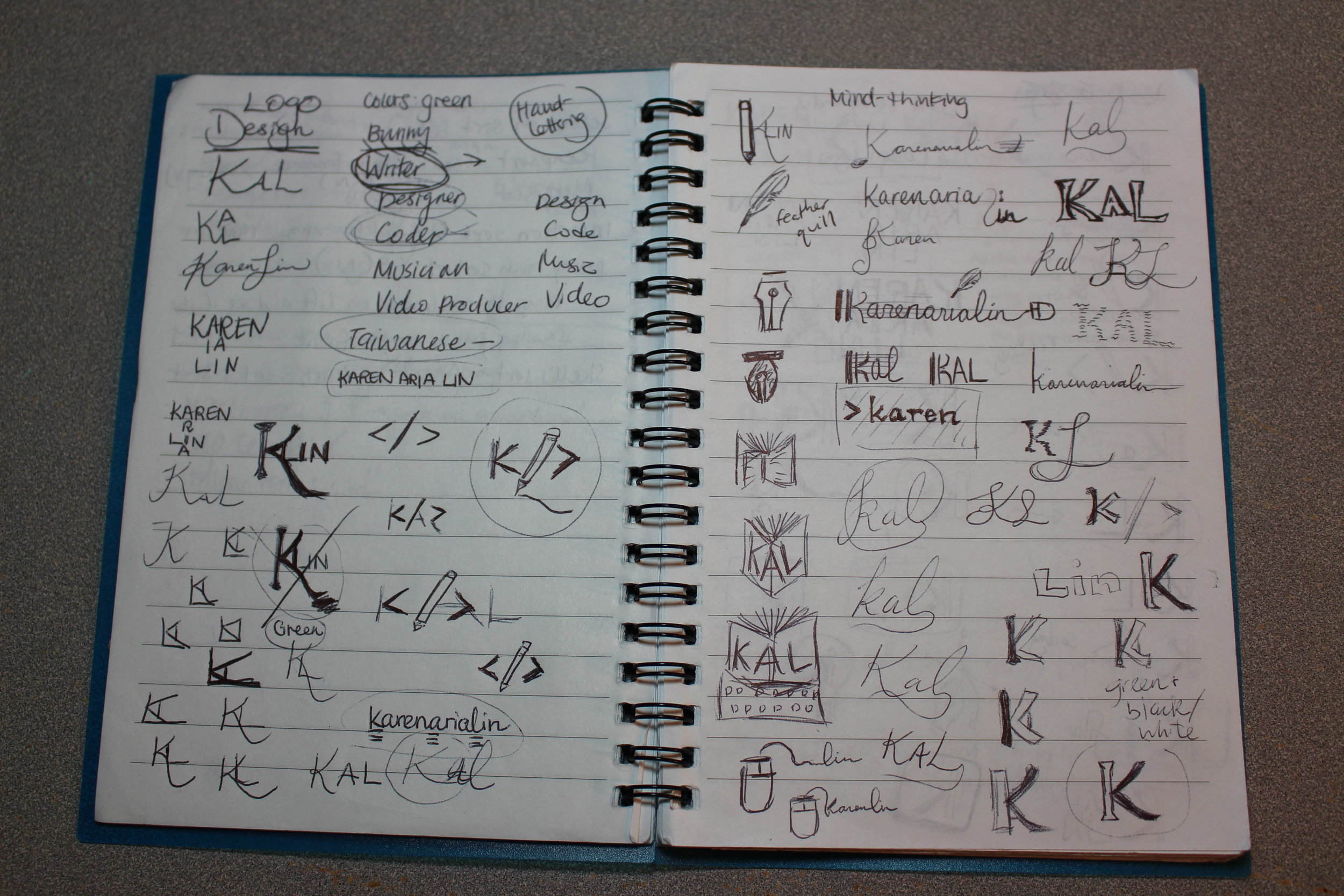
brainstorming.JPG

I researched techniques for developing logos. The most clever ones are simple but have multiple layers of meaning. They can be easily drawn, reproduced, and scaled while representing the style and values of the brand bearer.

Define & Ideate

Armed with pen and notebook, I sketched out ideas that represented my interests and identity. The design I settled on was a simple and subtle “K” that combined a Western font with part of the Chinese symbol for “water.” Perfect for an Asian American.

Implementation

Once I had my designs on paper, it was simple enough to draw them out in Adobe Illustrator.

Conclusion

I’m happy with the design, except that the serifs in the left half made the whole “K” look old-fashioned. I later swapped it out with a sans-serif font. 

Fun fact: In the music logo variation, the K resembles the alto clef symbol that is used in viola sheet music. The music notes are at the “A” and “E” position to represent the vowels in my name.


Work background.png
 

Overview

Problem: Currently, wineries have some difficulty promoting their events to potential visitors, and wine lovers need a consolidated platform to discover new wineries and wines. Many wineries are understaffed and have to use multiple software tools to manage inventory and social media.

Solution: A digital marketplace for wine. Wine consumers discover new wines and wineries through the Palate app, while winery owners enter information through the portal. Palate also wants to leverage data about consumers to provide better wine recommendations for users.

Users: Winery owners, wine consumers

Result

About.png
Wines (list).png
Add Event .png
 

Tools Used

Sketch, Invision, Django, Materialize.css

Process

Understand & Explore

I'm not a huge wine drinker, so I had to understand the wine industry first and how our product will fit in among existing wine apps. While other wine apps aim to be distributors, Palate functions as a marketplace to connect businesses directly with consumers. We want to target users who drink wine casually rather in addition to consumers who know more about wine.  

Our messaging is focused on education: "Discover" and "Learn" about wine. 

Define & Ideate

As part of the process of learning about users, I defined the wineries' and wine lovers' pain points and created personas. 

Winery Owner.png
Wine Consumer.png

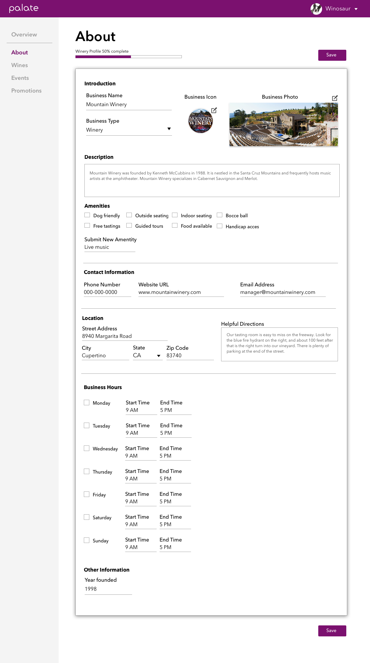
The product consists of a portal for winery owners to input their winery and wine information, which users can discover on the Palate app. Now that I had a better understanding of the business owners who'd be using the portal and what kinds of problems they needed us to solve, it was time to design a portal that had easy-to-use forms. 

Old About.png

Forms are often a pain to fill out. How do we group the fields in a way that prioritizes information clearly? I tried placing the app next to the fields so that users could see how their entries would be reflected in the app. This placement would also build a foundation for the live preview we planned to include in the future. After getting buy-in for my Balsamiq prototype, I drew up the high fidelity version in Sketch. 

Prototype

During our team review, with many fresh eyes looking at the design, it was clear that the layout would hinder mobile responsiveness.  We suggested creating a design that mimicked the look and field order of the app. The result was a cleaner form that received more positive feedback. 

Sign Up flow.png

Along the way, I created a sign up flow for logging in and resetting passwords. Onboarding is often the most crucial part of a user flow, so we had to determine the minimum amount of information we would need from the user before granting them an account. There was some complexity in that we already had some data scraped from the Web, and whenever a new user signed up we had to verify if they already belonged to an existing winery in the database. 

I identified two flows: one that started with Palate contacting business owners, and the other starting with business owners signing up through our marketing page. 


Implement & Test

Once the designs were nailed down, we started on implementation. I switched to a front-end developer role to redesign the existing portal and connect some additional fields to the database. 

We're currently in the user testing phase. With more feedback, we'll know which features work best, and what we'll need to include in the next iterations. 

Conclusion

Working with a team - even with non-designers - can yield good ideas during the design process. I'd like to say that I had a thick enough skin to not take things personally when people critiqued my designs. Everyone has the same mission to make the product better.

While designing, it's easy to start thinking about technical details when I know I'll be implementing the design later on. But while I'm wearing the design hat, I have to focus on the user experience.

The project is still ongoing and the portal is going through new and improved iterations. I am also working on user research for a wine recommender that's tailored to each person's level of wine knowledge. More details to come later. 


Work background.png
 

Overview

Irish Independent is the second largest newspaper in Ireland. I contributed footage, graphics, and writing for various projects while I was a Multimedia intern there.

Highlights

Screen Shot 2016-10-16 at 5.06.59 PM.png

To put together this package, I wandered the streets of Dublin, conducting interviews with a fellow intern and collecting b-roll footage. Back in the newsroom, I edited the video and wrote an article to accompany it.

During a weekend trip to beautiful Barcelona, I shot video footage to help travel reporter Pól Ó Conghaile produce this feature about the famous tourist crowds.

Tools Used

DSLR, Adobe Premiere Pro

Process

Understand & Explore

During my internship in Dublin, I was an outsider trying to learn everything I could about Ireland through my internship. I eagerly collected video footage during my weekend trips to other Irish cities and neighboring European countries. My music major self was especially interested in Grafton Street, which attracts street performers from around the world. 

Implement

I spent a day wandering the streets of Dublin, interviewing street performers about their experiences. I collected enough information to edit together a roughly 3 min video and write an article. The featured story ended up being the buskers’ struggle with new legislations restricting their access to the streets.

Conclusion

I was grateful to intern for a newspaper that gave me free reign to use their video equipment for my own projects. It was intimidating to approach random strangers in a foreign country while hauling heavy equipment, but the conversations I had were rewarding. Some of the musicians were foreigners too!


Work background.png
 
Campanile CelloAdobe Photoshop

Campanile Cello

Adobe Photoshop

Graphic for The Daily CalifornianAdobe Photoshop

Graphic for The Daily Californian

Adobe Photoshop

Pen Tag, designed for my blogAdobe Illustrator

Pen Tag, designed for my blog

Adobe Illustrator

Graphic for Irish Independent’s Travel TV seriesAdobe Photoshop

Graphic for Irish Independent’s Travel TV series

Adobe Photoshop

Rakuten California Roll team logoAdobe Illustrator

Rakuten California Roll team logo

Adobe Illustrator

Hogwarts tapestryAdobe Illustrator

Hogwarts tapestry

Adobe Illustrator

Graphic for The Daily CalifornianAdobe Illustrator

Graphic for The Daily Californian

Adobe Illustrator

Taiwan 101 building in TaipeiAdobe Illustrator

Taiwan 101 building in Taipei

Adobe Illustrator

Spider-Man CampanileAdobe Illustrator

Spider-Man Campanile

Adobe Illustrator

Rakuten Tigon team logoAdobe Illustrator

Rakuten Tigon team logo

Adobe Illustrator


Work background.png
 

Overview

Problem: We like to ask each other for our rankings, like “What are your favorite books?” or “Rank the top 10 Michael Jackson songs.” There should be a tool to help you methodically compare each item in a list two by two and return the final ranking. 

Solution: A simple web app where you input a list of items you want to rank in order (such as the seven Harry Potter books) and compare the items to each other.

Users: Anyone, especially avid list-makers

Result

Building the list

Building the list

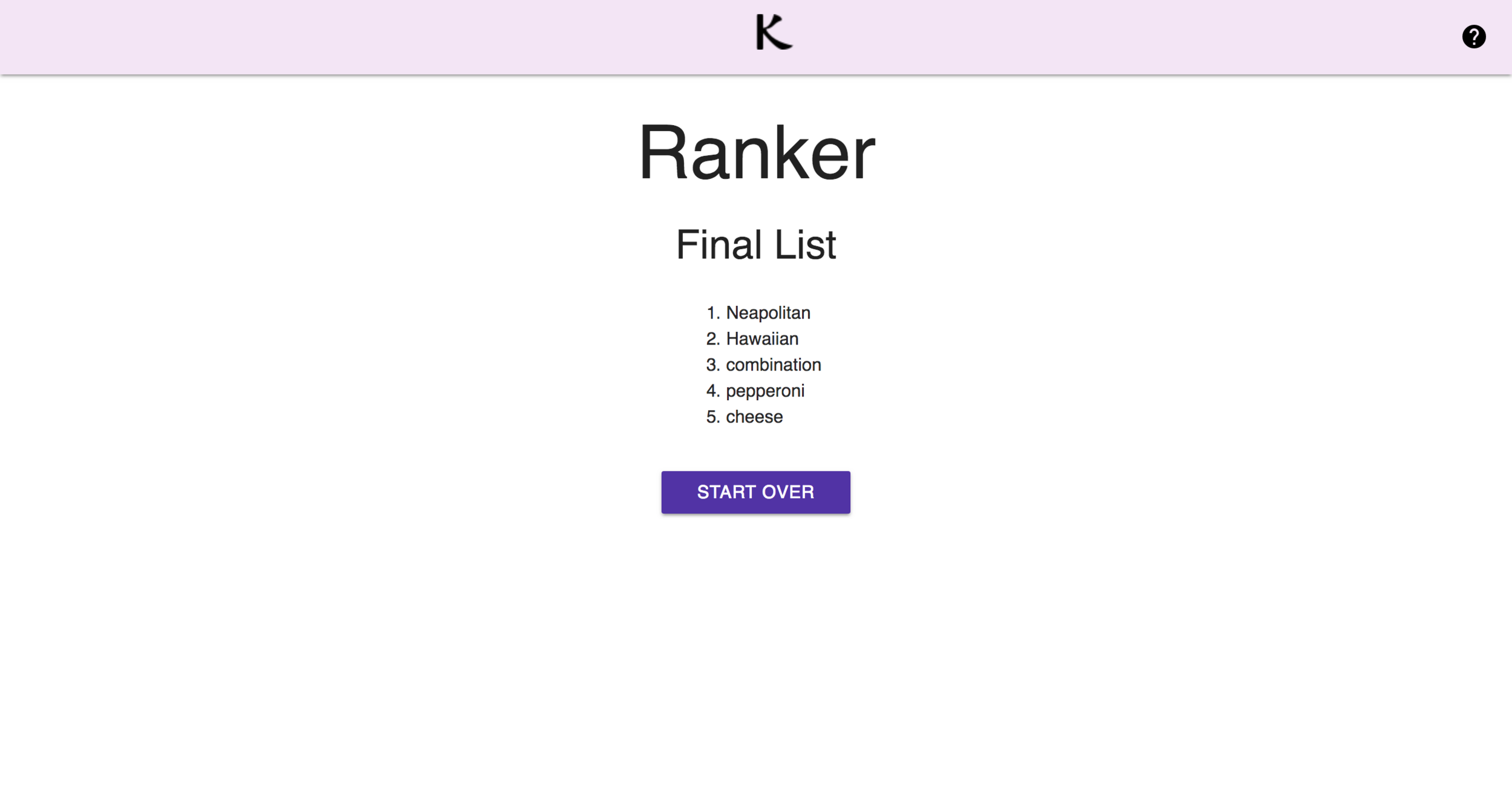
Final list

Final list

Sorting the list

Sorting the list


Tools Used

React JS (original tutorial by Michael Cheng), Materialize, Github Pages, Python

Process

Understand & Explore

As an avid list maker and budding programmer, I wanted a more scientific way to rank a list by comparing the items to each other. I did research to see if anyone had already built tools to accomplish this goal. The closest thing I found was a forum thread asking if anyone had built such a tool.

Define & Ideate

At this time I was learning about sorting algorithms in class. These algorithms can easily sort a list of numbers, but for a list of non-numeric items, I’d have to adapt them to ask for a user’s preference every time they compared two items. I decided to use Shell Sort, which gives you a general overview of the entire list before combing through it in more detail.

Prototype

My first step was to build a Python program that accepted user input through the terminal. After some agonizing over the algorithm on a whiteboard, I got it to work on my local machine and asked for advice on my blog on how to adapt it for the web.

Implement, Test, Iterate

My next step was to recreate the program using ReactJS and deploy it through Github Pages. I tested with people, fixed bugs, styled it, and fixed more bugs.

Conclusion

Some computer scientists who tested the tool pointed out that there are faster algorithms that require fewer comparisons to sort a list. In the future I could experiment with using alternative algorithms for Ranker. 

The Ranker tool also highlights a flaw in the transitivity of preferences. People don’t always prefer x over z even if they prefer x over y and y over z. That’s fine! The limitation of this tool is that it uses subjective human preferences as data, which can change at any time.   


Work background.png
 

Overview

Problem: To try out AR development, a team of us at Rakuten built an app for a company hackathon that we planned to finish in 3 hours, give or take. None of us had used Apple’s ARKit or Swift before, and only one of us had iOS development experience.

Solution: An AR game based on finding Slender Man, who randomly appears in the space around the player. The app was inspired by a horror game where players must avoid being seen by the scary, mythical Slender Man. 

Users: Anyone with an iPhone 

Tools Used

ARKit (the framework used to develop AR apps for iOS), XCode

Process

Understand, Explore

slendermanreq.png

We attended a few workshops with the company’s Mobile Developer club in the weeks before the hackathon to get an overview of AR development. Since the AR space was 3-dimensional, we had more nuances to consider, such as getting virtual objects to recognize flat planes in the environment around the user.

Define

Right before the hackathon, we brainstormed app ideas as a team. The app had to be a self-contained experience that we could pitch as a complete idea and build within a few hours. I put together a quick list of requirements and drew out what the flow would look like.

Ideate, Prototype

Despite not having much iOS mobile experience, the engineers were able to learn Swift on the fly. Each person took on a different component, such as finding a 3D model of Slender Man and placing him in the project, and getting instructions to show up on the screen.

Iterate, Implement

Halfway through the hackathon, we realized the original requirement wasn’t going to work when the developers struggled to add a timed counter to the app. Since we were constrained by both a deadline and dev resources, the scope had to change. I changed the game from avoiding Slender Man to finding him by tapping him whenever he spawns, which actually made the game more logical and proactive (and less complex for our developers).

SlenderFlow-before.png
SlenderFlow-after.png

My favorite challenge was figuring out where Slender Man was going to appear in the 3D space around the player. Each plane, X, Y, and Z had a range - ex. (-9, 9), that determined how far away (top to bottom, left to right, front to back) the Slender Man model was going to appear for 3 seconds at a time. I collaborated with an engineer to figure out the range, using trial and error to find out which numbers worked to keep Slender Man within a reasonable distance from the user.

Slender Man model in XCode

Slender Man model in XCode


Refine

Even the finishing touches posed challenges, since we were working in a 3D space. We had to figure out how to display the opening instruction: "Find Slender Man.” I changed it later to the more explicit instruction “Tap Slender Man.” Also crucial to the game was a counter that incremented whenever the player was able to find and tap on Slender Man. 

One of our engineers added a nice touch to the UX where the app would play a creepy sound every time Slender Man spawned in the space to indicate that he was there and add a scary atmosphere to the game.

Present

I put together a PowerPoint presentation in typical product management fashion and rallied the team to present each part that they worked on. It was rewarding to pitch and demo our app to a crowd of judges consisting of the company’s upper managers, but we did it!


Conclusion

Due to limitations in our technical skill, we didn't use Unity or integrate other software to create fancy graphics. But I must say that the most useful skill we learned was how to build and quickly iterate on a product to ship a workable MVP. For me, it was product management distilled down to its purest form: ideating, developing, adapting to changing circumstances, and shipping. The step-by-step problem-solving process I went through with my team was well worth the challenges of being new to the AR space. 


Work background.png
 

Product Marketing Copy

How to Create a Competitive Analysis for Software Products

I published a product management article for CloudApp about conducting a competitive analysis for software products.

Rakuten Marketing

A team developing their deep linking product at Rakuten Marketing needed a user story to demonstrate how their product would be used in different settings. I wrote the stories and recorded each one for a separate video, for which I also created the graphics and animation using Adobe Illustrator, Premerie Pro, and AfterEffects.

Still from marketing video

Still from marketing video

Storyboard I created to show the user story

Storyboard I created to show the user story


Attribution Copy:

Let’s say you’re the marketing manager at a department store called Jackson’s. For the upcoming sale that lasts from after Black Friday through Christmas, you’re launching a Buy 1 Get 1 Free campaign for winter clothing through Jackson’s mobile app. You’re advertising the campaign by placing ads on the web, and you want to find out which of the three ad designs actually generated the most sales revenue. Trouble is, you can’t tell how many people are clicking on your ads, installing your app, or actually buying anything. With Rakuten Marketing’s attribution technology, deep links track customers throughout their journey, from viewing an ad to making a purchase. Viewing the dashboard, you can see a complete breakdown of user data. Now you can use this data to make better product and marketing decisions!


Still from marketing video

Still from marketing video

Storyboard I created to show the user story

Storyboard I created to show the user story


Deep Linking Copy:

You’re the marketing engineer at Timothy Hartwood Bank. You want to encourage parents to sign up for savings accounts, so you create a financial calculator app called Savings for Kids that parents can use with their children to show how much money they can save over time with an account. You create some banner ads that will take customers from a webpage to the app. The problem is, regular web hyperlinks can’t take customers directly from a search or embedded link to a page in your app. But with Rakuten Marketing’s deep links, you can! And if customers don’t have the app installed yet, Rakuten Marketing’s deferred deep links will first take them to the app store, then directly to your app after they install it.


Palate Wine Flyers

I wrote and designed flyers for the Palate app and portal using Sketch.

B2B portal flyer

B2B portal flyer

Consumer app flyer

Consumer app flyer

User Help Guides

Palate Wine

I wrote the help guide for new users of the Palate portal on our Zendesk site.

Excerpt from About page:

The information you fill out on the About page will appear in your Winery profile in the Palate app. You can edit this information at any time. Required fields are marked with red asterisks.

(photos of portal and app side by side)

Fill out the basic information: Business NameBusiness TypeDescriptionPhone NumberEmail Address, and Location

  1. Add a cover photo and profile picture to make it easier for visitors to identify you.

  2. Amenities: Check the amenities that your business offers for visitors. 

  3. Business Hours: Check the days of the week that your business is open to the public. If you are only open by appointment on certain days, check Appointment Only for those days. 

  4. You have the option to provide your business's founding year and your Facebook URL.

  5. Click Save to save your changes.


The Daily Californian

Screen Shot 2018-10-24 at 3.42.42 PM.png

As the Multimedia Editor at The Daily Californian, UC Berkeley’s campus newspaper, I wrote a guide on how to publish posts on the paper’s WordPress site.

Looking back on this document after a few years of experience, I can make the following critiques:

  • Some UI labels are bolded, some are not, and still others are in quotation marks. For consistency, pick one format, preferably capitalized and unbolded

  • Be consistent with periods. Add one to the end of each sentence. 

  • Make the headings for each step more prominent.

  • Don’t use letters for annotations - use numbers for each sub-section like 2.1, 2.2.

  • Choose a more prominent heading format for Troubleshooting FAQs to distinguish it from the other steps.

  • Daily Cal should be italicized, since it’s a newspaper.


UI Labels and Error Messages

Rakuten

I worked on UI reviews for the Rakuten Merchant Server (RMS), which helps merchants sell products and manage logistics through their online stores. The UI for RMS is translated into several languages, so the copy had to be simple and translatable. I also worked on the Internal Business Server, a portal that helps Rakuten employees manage merchants and their stores. Generally, I reviewed wireframes created by product managers.

Examples:

Before

 Ready to Shop Open

(label for a switch that toggles the visibility of a merchant’s store on the Rakuten site)

Analysis

  • My guess is that since the object comes before the verb in Japanese, the original author of this label wrote “Shop Open” by mistake, and it stuck. 

  • “Ready to” is redundant. The switch is either on or off; there is no intermediate “ready to turn on” stage. Since concision is key in technical writing, we can get rid of “ready to.”

After

Open Shop


Before

Please enter a valid format on “Order Date”. Please use DD/MM/YYYY.

Analysis

  • "Please enter” is fine - it clearly and politely instructs a user to do something.

  • We can condense two sentences into one. “Valid format” is redundant with DD/MM/YYYY.

  • Quotations are distracting and difficult to translate. UI labels can be capitalized, bolded, or both depending on the style guide.

After

Please enter an Order Date in DD/MM/YYYY format.


Before

Sorry, page not found. 

Try again later!

Analysis

  • Rakuten’s audience is mainly Japanese, so “Sorry” by itself sounds flippant. In most cases, a simple Page Not Found message on a 404 page is fine.

  • Since a 404 page is a result of a broken or incorrect link, it’s unlikely that trying again later will fix things. A more helpful followup to the error message would be to provide links back to the homepage or to the help desk.

After

Page Not Found

Go back to Home (link to home)

Contact us for help (link to help desk or support email)


Work background.png